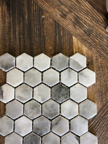
50 Shades of grey
Get The look
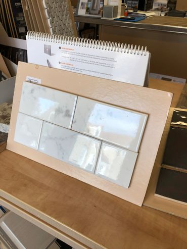
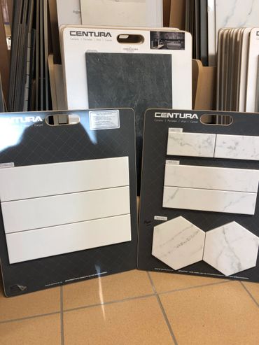
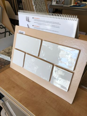
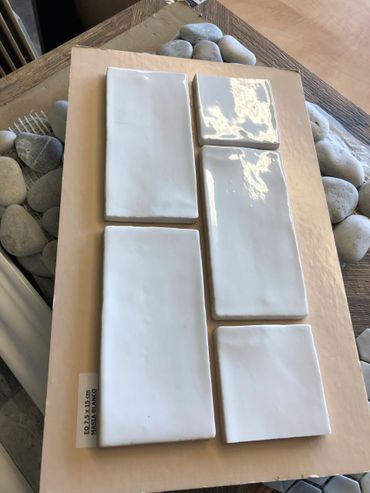
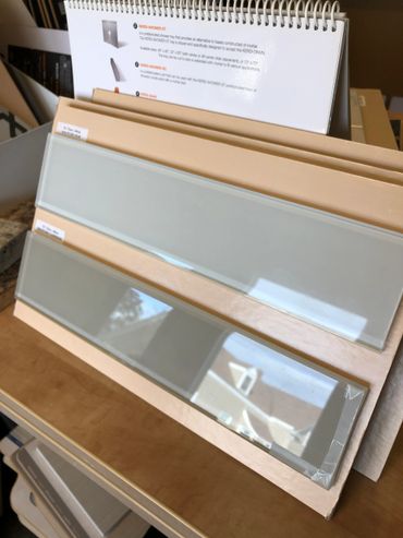
Bright whites and greys are trending right now for many reasons. Just as chefs and doctors wear white uniforms to show cleanliness, a bright white kitchen or bathroom isn't able to hide any crumbs or dirt. Other reasons white is trending is because it reflects light making it great to photograph. If you are a blogger or foodie who loves taking pictures of food or creating makeup tutorials in your bathroom, white is the way to go.
How to get the look
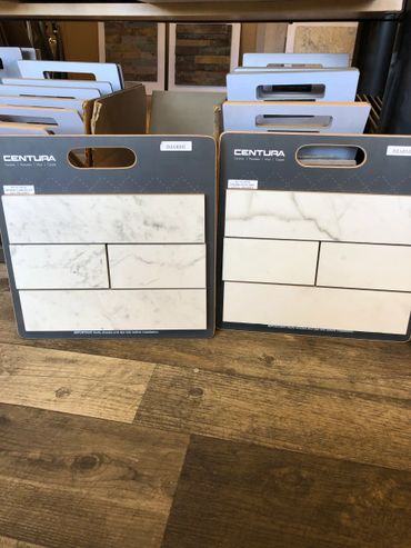
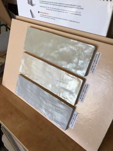
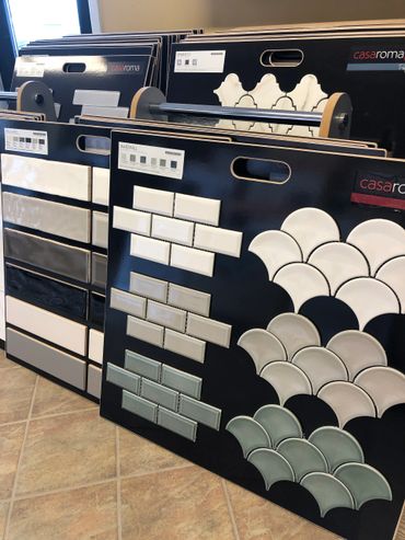
You should use at least 3 shades of grey. The grey can be slightly coloured to pull colour from the surrounding decor.
To get the look, you should have:
1. shades of grey
2. a mix of matt and shiny finishes
3. metal accents
4. pops of colour
5. good lighting
You can get this by:
· 2/3 of the largest surfaces in your space should be grey (floor, cupboards, counters, walls, backsplashes, island, shower, or tub)
· use silver to create depth and stay on pallet
· to follow the 2/3 rule, you could have white walls, grey cupboards, and a wood countertop, or, a marble countertop, white walls, and wood cupboards.
· add pops of colour with flowers, vases, fruit bowls, dishes, an area rug, etc.
Find more Inspiration on our Pinterest page!
Planning a renovation can be a lot of work. It takes a lot of decisions making, money and vision. We're here to help! check out our inspiration pages on Pinterest. You'll find many designs to use as a reference for your renovation and design projects

Area Rugs
Area rugs are like art for the floor. You can continue the grey theme with a rug or introduce a splash of colour. Click below to browse our area rug selection

Shades of white & grey
Use at least 3 different shades to create depth. These colours can be applied to the floor, backsplash, cupboards, rugs, and countertops. Our favourite paint colour is cashmere grey because it pulls colour from whatever is next to it

Accent colours
Your design might appear bland if you don't introduce a touch of colour, even it it's just a variety of wood shades, metals or flowers.
VISIT OUR SHOWROOM FOR MORE PRODUCTS at 197 KINGS RD, SYDNEY
Copyright © 2025 Headings The Floor Store - All Rights Reserved.


